Smartsheet
Making Smartsheet easier to start and easier to administer
Two 2022 projects for Smartsheet, the no-code work-management platform — one for the administrators who pay for it, one for the prospects trying it for the first time.
- My Role
- Senior Product Designer
- Company
- Smartsheet
- Timeline
- Jan–Aug 2022 · two projects
- Focus
- Enterprise SaaS · Admin & Commerce · Product-Led Growth
- Deliverables
- UX Research · UX Architecture · System UI Design
Chapter 01
Unified Plan & Billing
- Timeline
- 6 months · Jan–Jun 2022
- Designed for
- Billing administrators
- Status
- Handed off to development · Q2 2022 launch target
My contribution
- My role
- Senior Product Designer
- Lo-fi wireframing during a one-week ideation sprint, building on the information architecture
- With the team
- Discovery: subscription data, experience maps, competitor analysis
- Defining the information architecture
- Stakeholder reviews and user-testing sessions
1.1The problem
Billing administration was spread across screens and sales channels
To see all of their subscriptions — and to change them — billing administrators had to visit different product screens or go through different sales channels.
How might we
…improve our subscription payment administration experience so customers spend less time administering Smartsheet and more time building Smartsheet solutions?
Designed for the Billing Administrator: purchases, payment methods, invoices and billing information.
One of three administration personas, alongside Team and IT administrators. Like IT administrators, billing administrators aren’t concerned with day-to-day work in Smartsheet.
1.2Research & discovery
Mapping where subscription management broke down
Discovery looked at subscription management from the Billing Administrator’s perspective: who holds what, how today’s flows work, and what comparable platforms offer.
Subscription data
| Subscriptions per account | % of all accounts | ~ Value of business (USD) |
|---|---|---|
| 1 | 92% | 45% |
| 2 | 5% | 21% |
| 3–9 | 2% | 23% |
| 10 or more | 1% | 11% |
| Products per subscription | % of all subscriptions | ~ Value of business |
|---|---|---|
| 1 | 96% | 58% |
| 2 | 2% | 12% |
| 3–9 | 1.5% | 26% |
| 10 or more | 0.5% | 4% |
Reading the data
8% of accounts held more than one subscription — together, about 55% of business value.
Sum of the 2, 3–9 and 10-or-more rows. Business-value shares are approximate in the source.
Experience mapping
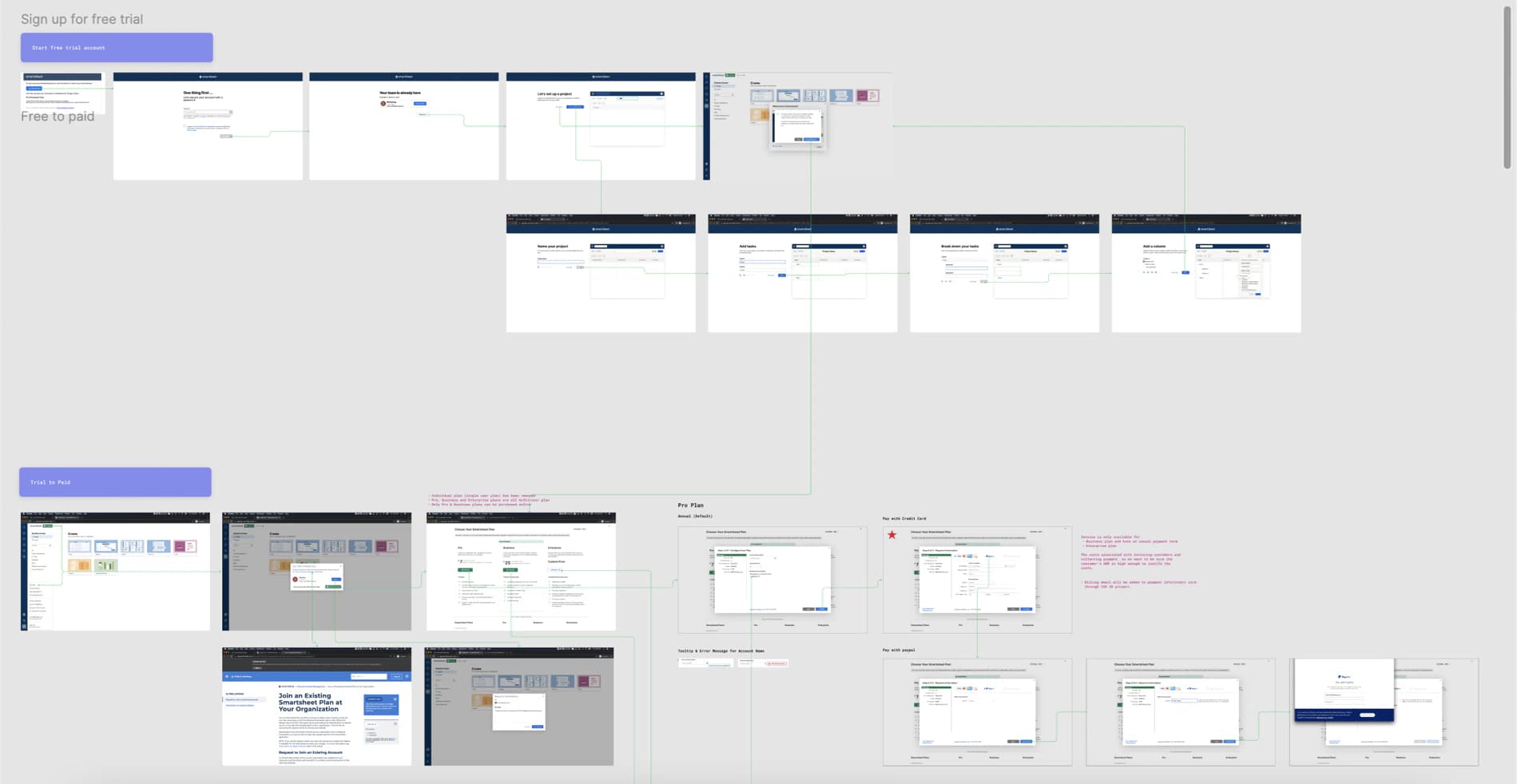
Today’s experiences were mapped screen by screen to find the pain points and leverage points with the most potential impact.
What to look for
- Two labelled paths: “Sign up for free trial” and “Trial to Paid”.
- Each frame is an existing Smartsheet screen; the lines are the click path between them.
- Annotations note that only Pro and Business plans can be purchased online. The redesigned Change Plan screen routes Enterprise to “Contact us”.
Competitor analysis
Billing-management capabilities were compared across Microsoft 365, Asana, Monday.com and Wrike, alongside a map of their payment experiences.
What the matrix shows
- All four let admins view their plan, add or remove licences, change payment term, manage payment methods, and view purchase history and invoices.
- None showed an assigned sales or customer-success contact.
- Only Asana and Monday.com listed support for billing questions.
- Only Microsoft 365 and Wrike let admins assign a payment method to each subscription.
15 capabilities · 4 platforms
| Capability | Microsoft 365 | Asana | Monday.com | Wrike |
|---|---|---|---|---|
| Manage subscription plan | ||||
| View purchased plan & service | Offered | Offered | Offered | Offered |
| Upgrade / downgrade plan | Not needed | Offered | Offered | Offered |
| Add / remove licence | Offered | Offered | Offered | Offered |
| Purchase support and service package | Not listed | Not needed | Not needed | Not needed |
| Change payment term | Offered | Offered | Offered | Offered |
| View payment info (outstanding balances, next renewal date) | Offered | Offered | Offered | Not listed |
| Cancel subscription / account | Not listed | Offered | Offered | Downgrade to free plan |
| Manage payment method | ||||
| Add / edit payment method | Offered | Offered | Offered | Offered |
| Assign payment method to each subscription | Offered | Not needed | Not needed | Offered |
| Manage billing contact | ||||
| Add / edit billing contact | Offered | Offered | Offered | Workspace owners are the billing contacts |
| Purchase history & invoice | ||||
| View purchase history | Offered | Offered | Offered | Offered |
| View and download invoice | Offered | Offered | Offered | Offered |
| Support | ||||
| View assigned sales or customer success contact | Not listed | Not listed | Not listed | Not listed |
| Contact support for billing questions | Not listed | Offered | Offered | Not listed |
| Communication | ||||
| Receive direct messages from internal teams for subscription or payment follow-up | Billing notification | Unknown | Unknown | Unknown |
● Offered. Blank cells are blank in the source matrix.
1.3Key findings
Admins couldn’t see everything they’d bought — or change it themselves
Fragmented visibility
Administrators knew their Smartsheet plan, but add-ons and other purchased products — including Resource Management and Brandfolder — were visible only in fragments.
“Finance has told me there is no way to view or access the contact information SmartSheet has for my business… I can never see it all in one place.”
Dependence on sales
Some customers couldn’t see their plans on their own and needed help to make any change — contacting sales reps, who had to look the account up in Salesforce. That cost both sides time.
“As an administrator, I should be able to add a new license without reaching out to sales or contacting anyone. I can do this on a myriad of other platforms.”
1.4Information architecture
One home for every subscription, payment and invoice
The IA consolidates what administrators previously had to piece together: one Plan & Billing landing page that summarises each area and links to the screen that manages it.
Plan & Billing landing page
Subscriptions
Every active subscription, across products, with its plan summary and details.
Payment & Billing
Accepted payment methods — credit card, PayPal, Bill-To-In-App, ACH, SEPA (future) — billing info with tax ID, and history & invoices.
Notifications
Payment-related notifications with required actions: upcoming bills, payment issues, follow-ups, expired cards.
Cross-sells
Selected products, add-ons and support options.
Support
Assigned sales and technical support, a customer-success contact and the billing & finance support centre.
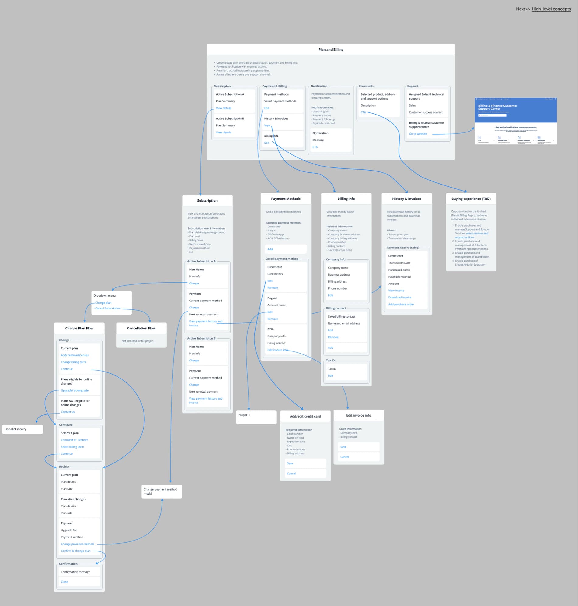
Change Plan flow
From the IA
Change
- Add or remove licences
- Change billing term
- Upgrade / downgrade, if eligible online
Configure
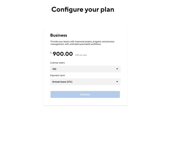
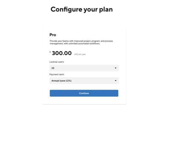
- Choose number of licences
- Select billing term
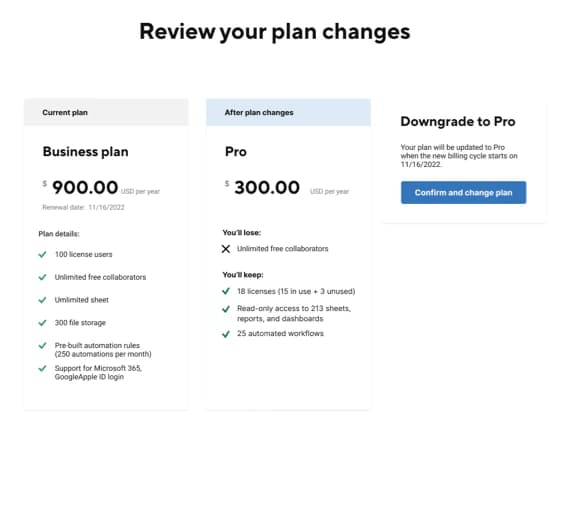
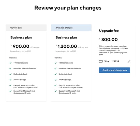
Review
- Current plan vs plan after changes
- Upgrade fee
- Payment method
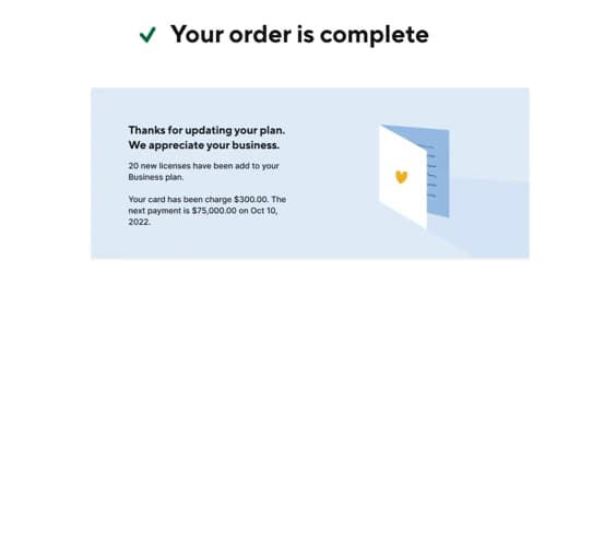
Confirmation
- Confirmation message
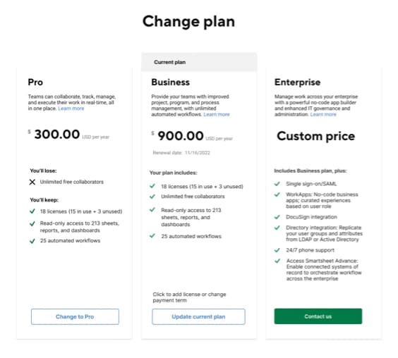
- Plans not eligible for online changes route to “Contact us” and a one-click inquiry.
- The cancellation flow is mapped but marked “Not included in this project”.
- A “Buying experience (TBD)” branch lists future purchases: Support and Solution Services, à-la-carte Premium Apps, Brandfolder and Smartsheet for Education.
1.5Wireframing sprint
One week, two layouts
Building on the information architecture, I moved into lo-fi wireframing: a one-week ideation sprint to explore layouts for UPBP.
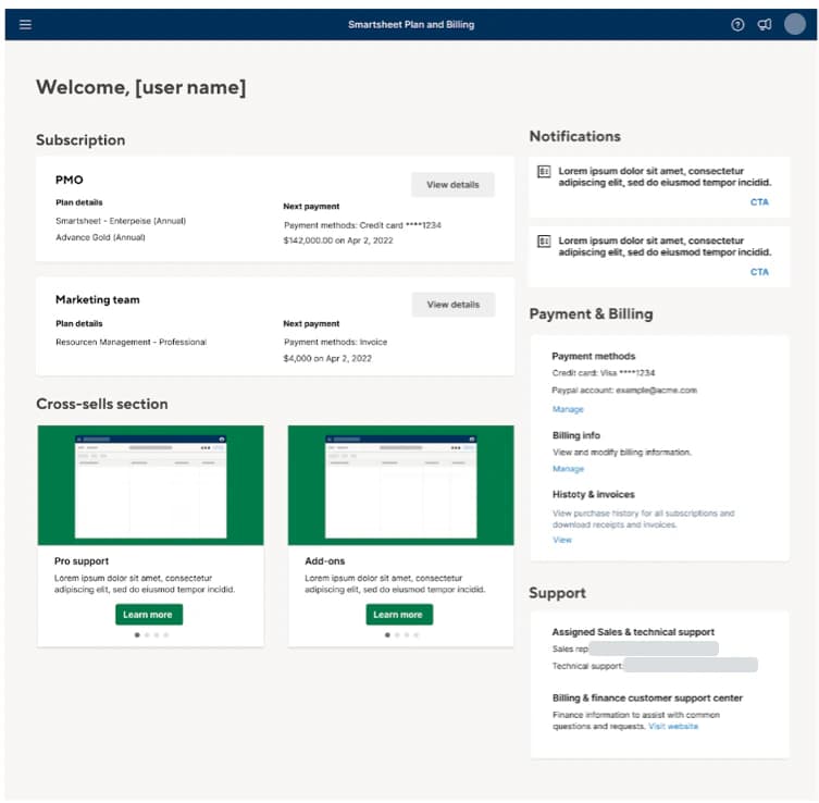
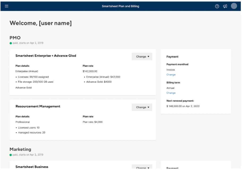
- Two columns: compact subscription cards and a cross-sells carousel on the left; notifications, payment & billing and support on the right.
- Teams as sections; each product a card with plan details, rate and a Change menu, beside a panel with payment method, billing term and next renewal.
- Home keeps the overview’s two-column structure; the Subscriptions view keeps per-team cards with a Change menu.
1.6High-fidelity design
Self-serve subscription management
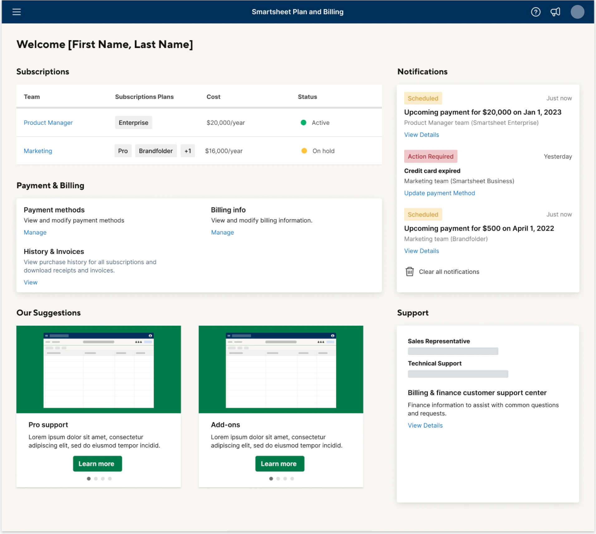
The final designs, after a series of iterations. Home is shown at the top of this page.
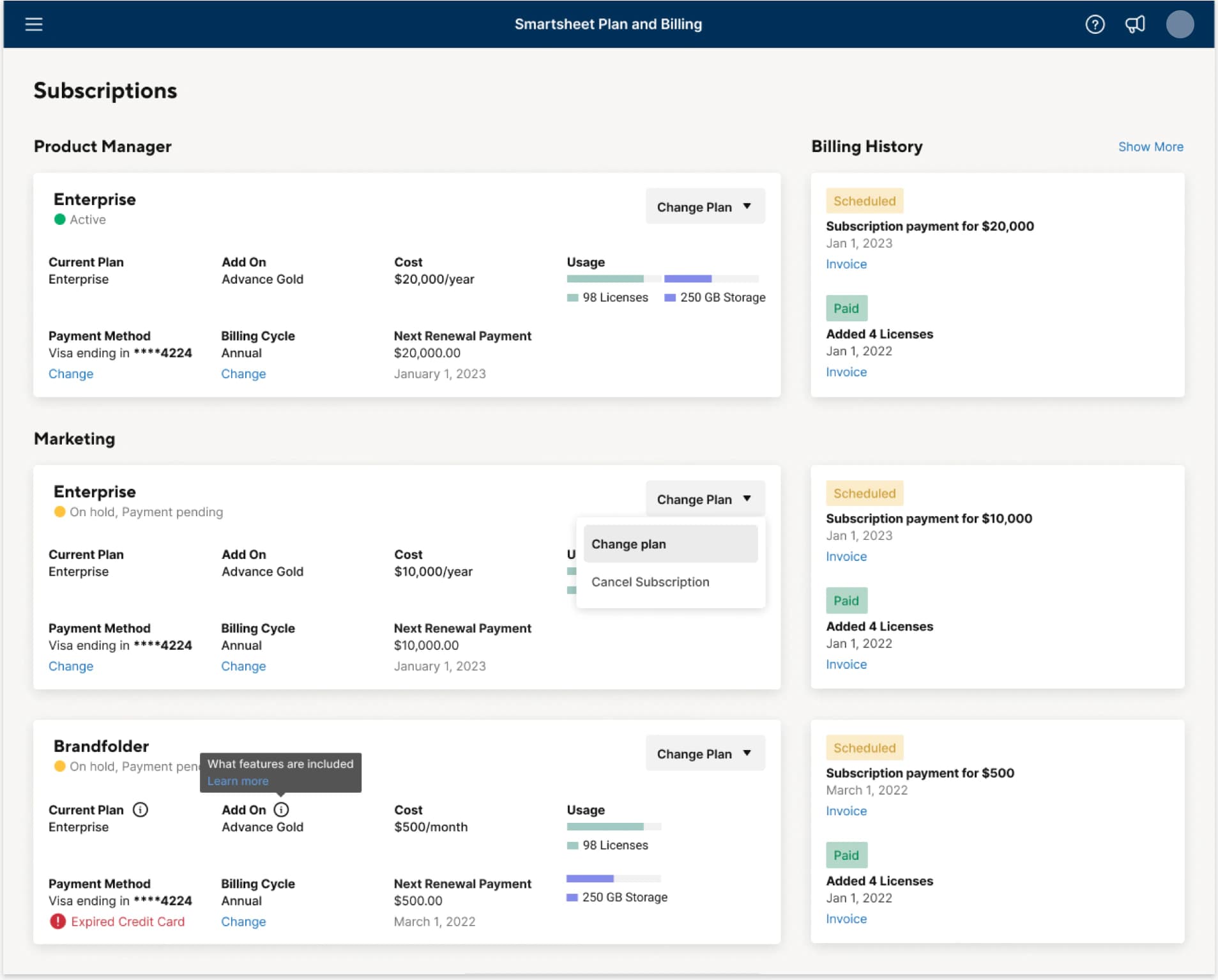
Subscriptions
Each team’s plans side by side — usage, renewal and payment method in one card, Change Plan in the card’s own menu, billing history alongside. Problems such as an expired card show on the subscription they affect.
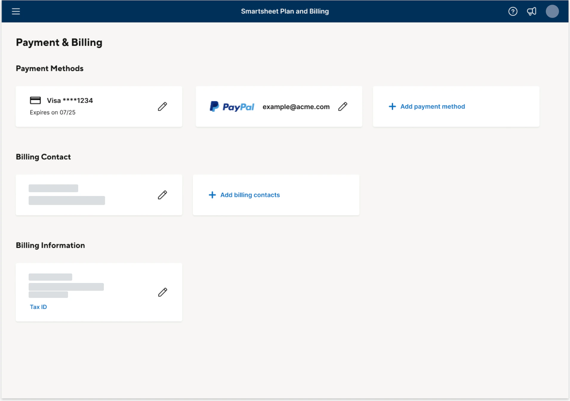
Payment & Billing
Several payment methods, billing contacts and company billing information, each editable in place by the administrator.
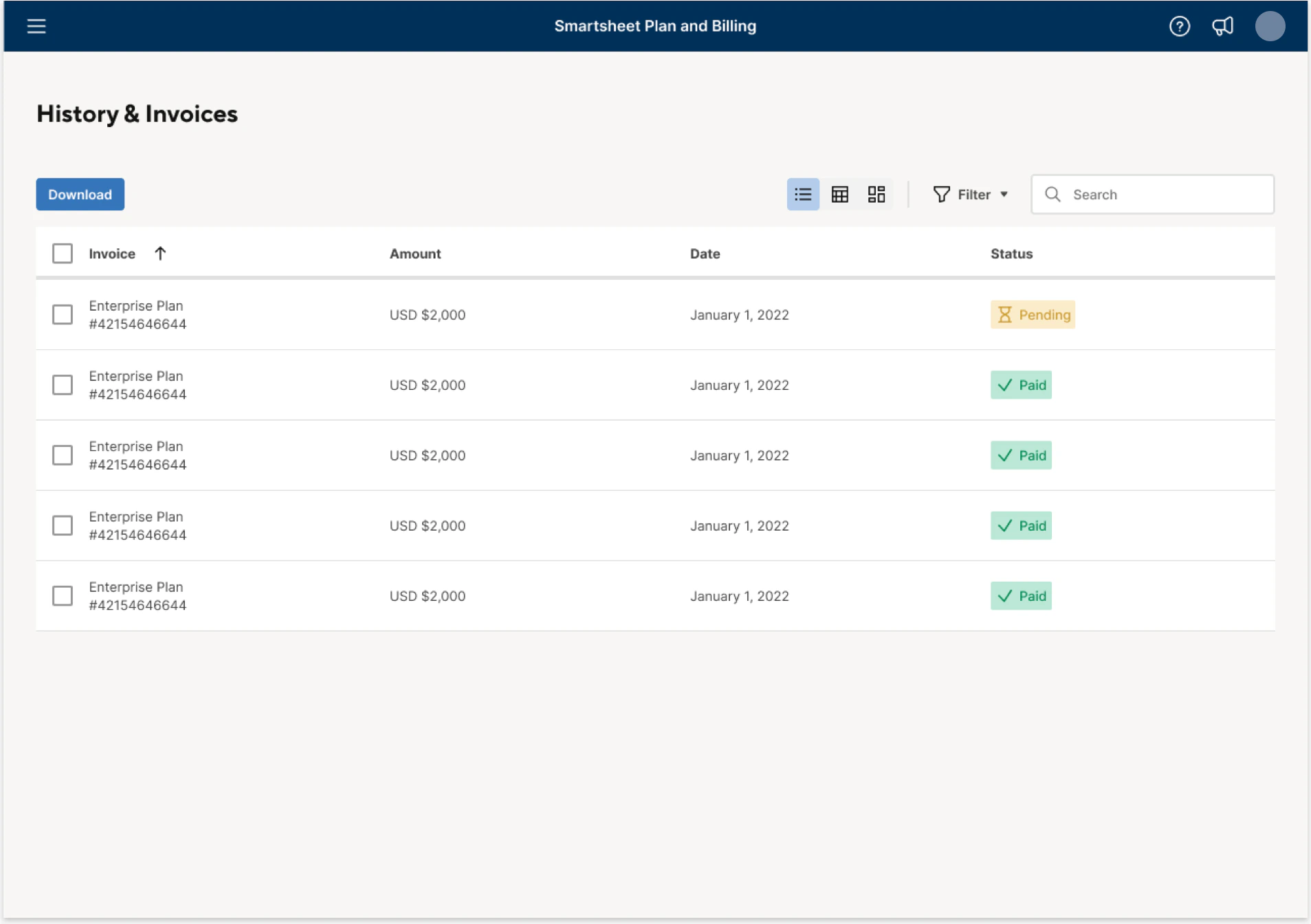
History & Invoices
Invoices for every subscription in one table, with payment status, search, filters and download.
1.7Change Plan flow
Changing a plan without contacting sales
Plan changes as a self-serve flow, following the IA’s four stages.
- 01
- 02
- 03
- 04
1.8Intended impact
What UPBP was designed to change
These are the intended effects and planned measures of success. No outcome data is part of this case study.
Intended business impact
An architecture that scales
An IA that is easier to adapt across products, customer plan configurations and packaging models.
A decoupling roadmap
A roadmap for extracting the current UX from the app-core code base, advancing a broader decoupling initiative.
Self-serve over support
More self-serve capabilities, intended to lower the volume of cases reaching internal support teams.
Planned success measures
- Fewer cases for simple changes to accounts and subscriptions
- Better response times for remaining customer requests
- Faster integration of new acquisitions into existing business processes
- Higher billing first-pass yield — more accurate address and tax information
- Lower share of low-ARR bill-to customers
- Higher customer satisfaction
Status
Handed off to development, with launch targeted for Q2 2022.
After stakeholder reviews and user-testing sessions. Whether and when it shipped isn’t documented here.
Chapter 02
Trial Signup Enhancement
- Timeline
- 3 months · May–Aug 2022
- Designed for
- Prospects starting a free trial
- Status
- Phase 1 launched · Q2 2022
My contribution
- My role
- Senior Product Designer on the design team
- With the team
- Primary research and baseline metrics: the Product-Led Growth (PLG) team
- Secondary research: the design team
- Stakeholder reviews and user-testing sessions
2.1Signup friction
Prospects were leaving before they reached the product
A poor sign-up experience left prospects struggling to get started and orient themselves in Smartsheet.
How might we
…improve our sign-up experience for trial users so customers experience little to no friction and get to the Smartsheet app as soon as possible?
Baseline — PLG team research, before this project
- deterred from continuing their trial by the email-verification step
- 15%
- of new sign-ups never log in — they don’t confirm their email and set a password
- 18%
- of first-time sign-ins leave within one minute of landing in the app
- 22%
- of first-time sign-ins leave within 30 minutes and never come back
- 46%
Other findings
Email-first sign-up
Email was the prominent sign-up mechanism, delaying prospects from landing in the app.
Redundant profile steps
Multiple profile-information steps created annoyance and redundancy.
Low-value first emails
First-touch welcome and reminder emails offered customers little value.
2.2Scope
Five product changes
The findings set the scope — the vision for the new sign-up and the basis for its business proposal.
SSO-first sign-up
More visibility for creating an account with Google or Microsoft.
One fewer Captcha
Remove Captcha from one of the two security checkpoints.
Deferred confirmation
Email sign-ups confirm later, not before they start.
Skip sign-up
Start a free trial without signing up first.
Better first-touch email
A first email worth opening.
2.3Current vs Northstar
From ten steps to six
The email sign-up path, as drawn in the source diagrams. In the current flow, a prospect answered profile questions, passed two Captchas, confirmed their email and set a password before inviting their team.
Current — web, email sign-up
10 steps
- Try Smartsheet for free
- Sign up
- Enter email
- Collect user info — name, phone number, job title
- CaptchaNot in Northstar
- Email confirmationDeferred
- Password setup and terms & privacy agreement
- CaptchaNot in Northstar
- Invite your team
- Smartsheet video
Northstar — email sign-up
6 steps
- Start 30-day trial
- Sign-up options and terms & privacy agreement
- Enter email and password
- Collect info — for sales follow-up and creating solutions
- Onboarding
- Email confirmation — when sharing, exploring or publishing assets, or inviting team membersDeferred
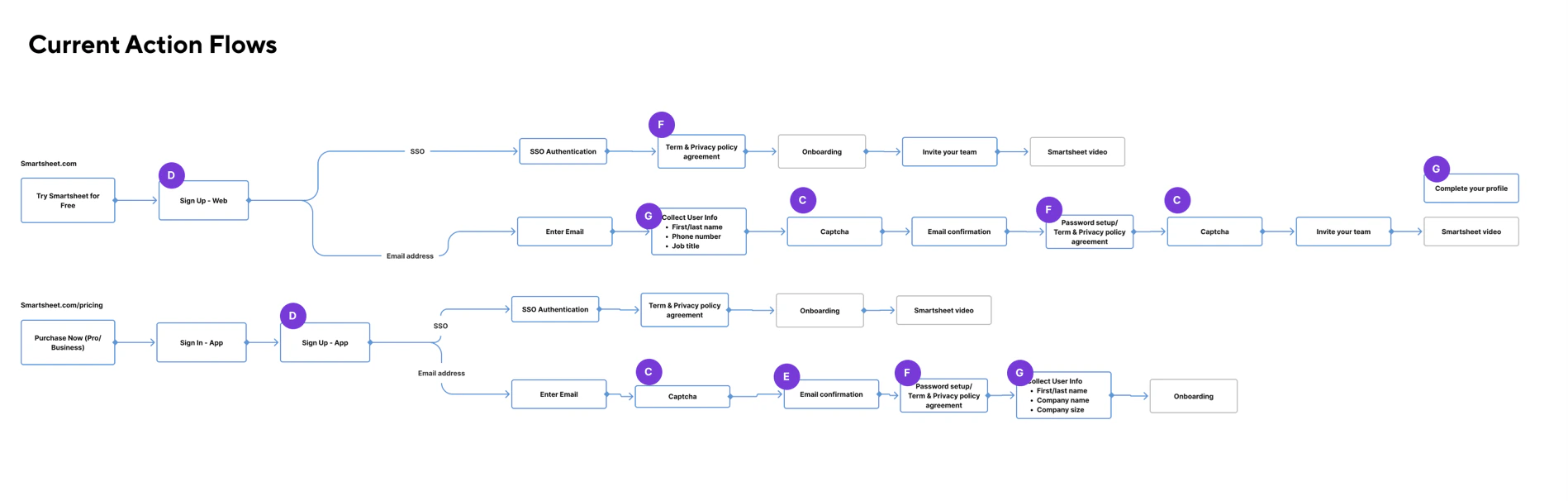
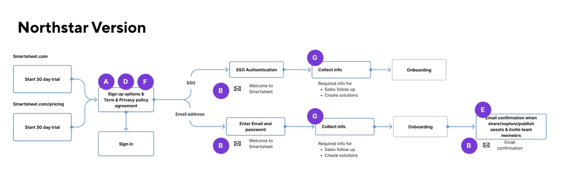
Lettered markers are from the source diagrams; their legend isn’t part of the original material.
2.4Requirements
Deferring confirmation without losing security or work
Temporary ID
“Skip sign-up” creates a temporary ID; saving work requires an account.
Confirmation triggers
Email sign-ups confirm only to share, publish or export, invite team members, or when the trial expires or they buy a plan.
Auto-save on exit
Nothing is lost while a user confirms their email.
| Start trial | Save | Share / Publish / Export | Invite team members | Trial expired |
|---|---|---|---|---|
| Create account with SSO | No action needed | No action needed | No action needed | No action needed |
| Create account with email | No action needed | Email confirmation | Email confirmation | Email confirmation |
2.5Phase 1 experiment
Testing SSO-first sign-up, web and app
Phase 1 tested short-term changes to the existing sign-up modal. Northstar is the long-term flow, planned for Phase 2 with a new onboarding experience.
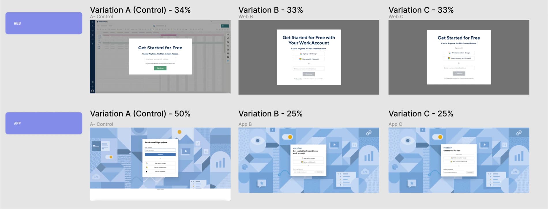
AVariation A · Control
Web: email only. App: email first, with SSO options below.
- Web traffic
- 34%
- App traffic
- 50%
BVariation B
Google and Microsoft above email, under “Get started for free with your work account”.
- Web traffic
- 33%
- App traffic
- 25%
CVariation C
“Work account on Google / Microsoft” buttons above email, under “Get started for free”.
- Web traffic
- 33%
- App traffic
- 25%
Percentages are the share of traffic allocated to each variant — not conversion results.
2.6Phase 1 specification
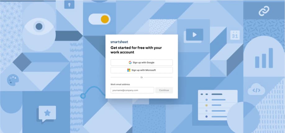
The final Phase 1 sign-up
Product decision
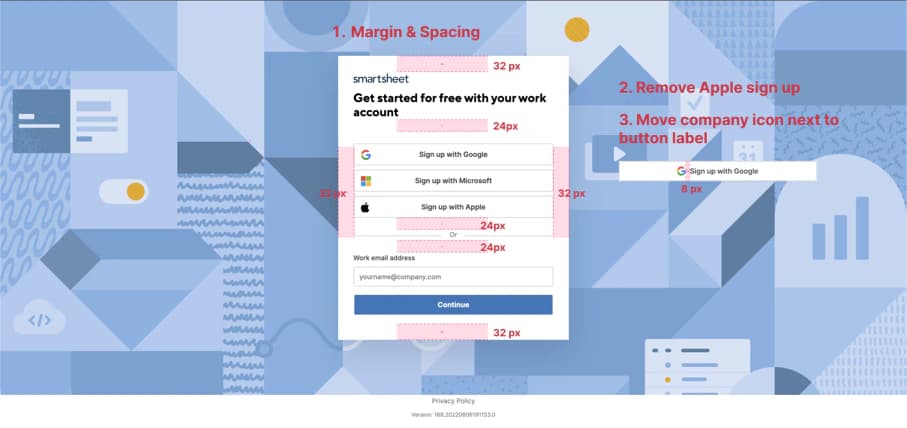
Remove Apple sign-up. Google and Microsoft remain the SSO options, above the work-email field.
Supporting specification
- 32px around the modal edges, 24px between groups
- Company icon beside the button label, 8px apart
2.7First-touch email
A welcome email with a job to do
The first email a trial user receives, reviewed on the draft.
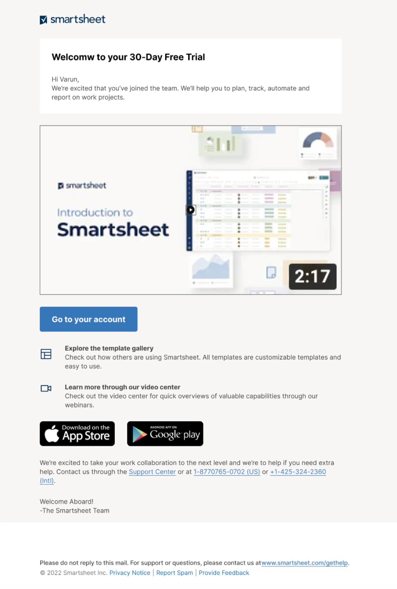
Review notes, by theme
Say what the trial includes
- “Communicate what we are including in the trial.”
- “Can we do some research and find out if there is something that we want to particularly promote in the email?”
- “Play with what content you want in the white background.”
Make the video easy to start
- “Can we make the play button bigger?”
Name the main action clearly
- “Button label alternates: Go to Smartsheet, Go to your account, Login now.”
2.8Launch
Phase 1 launched in Q2 2022
After stakeholder reviews and user-testing sessions, Trial Signup Enhancement moved into development.
Phase 1 · Q2 2022
Launched: the sign-up quick win — short-term fixes, tested through A/B testing.
Phase 2 · Q3 2022
Scheduled: a long-term trial sign-up integrated with a new onboarding experience.
Conclusion
Two ends of the same customer relationship
Both projects were designed to shorten the distance between intent and product: fewer steps to start a trial, fewer hand-offs to manage a plan.
- 01 — Unified Plan & Billing
- Unified billing administration: one place to see and change every subscription, payment and invoice, designed for self-service.
- Handed off to development · Q2 2022 launch target
- 02 — Trial Signup Enhancement
- Lower-friction sign-up: SSO-first entry, deferred confirmation and experiment-ready Phase 1 variants.
- Phase 1 launched · Q2 2022
- My role
- Senior Product Designer on both projects, with UX research, UX architecture and system UI design as deliverables.