Infosys / Finacle
Giving core-banking loan management a clear hierarchy
Finacle is a core-banking platform used by financial institutions. As part of a wider redesign in 2019, our team rethought the loan-management experience for bank staff working with complex financial information, dense forms and bank-specific configurations.
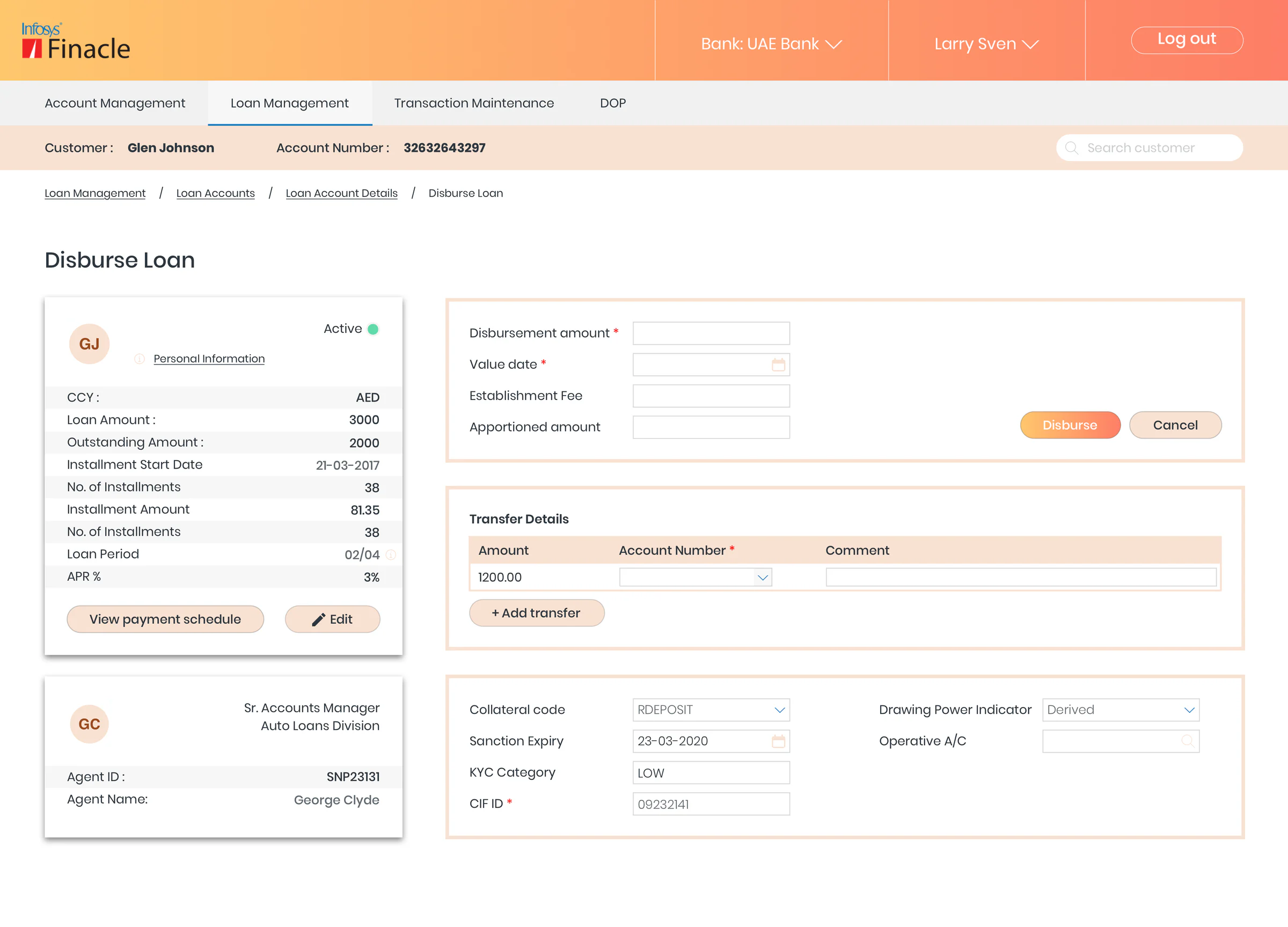
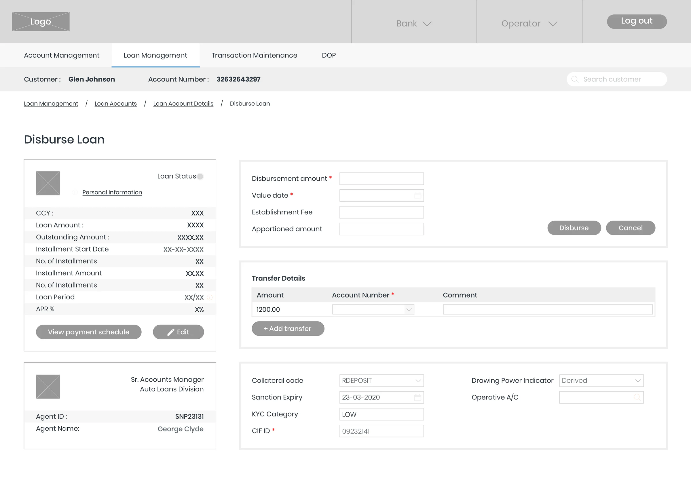
The redesigned Disburse Loan screen.
- My Role
- UX Designer
- Company
- Infosys
- Product
- Finacle core banking · Loan management system
- Timeline
- Aug – Nov 2019 · 12 weeks
- Deliverables
- UI Design · Prototyping · Service Design
My contribution
- My role
- One of two UX designers on the 12-person core team for the loan management system.
- What I worked on
- The loan management system, my personal focus within a redesign that ran credit card, loan and account management in parallel teams.
- With the team
- Research, workshops, the UX architecture, wireframes, the prototype and UI specifications, alongside a project manager, system architect, business analysts, developers and testers.
- The design proposals described here were the team’s.
01The problem
A core system that had outgrown its interface
Bank staff spend most of their working day in Finacle’s core banking system. The interface they worked in had been built for an earlier generation of the product.
What made it difficult
Built for older flows
The outdated UI couldn’t support business flows that had developed in the industry over the years.
An inconsistent architecture
The core banking solution had been a stand-alone system, which led to inconsistencies in its UI architecture.
One product, many banks
The redesign had to stay standardised across banks while leaving room for each client’s customisation requests.
The legacy loan screen
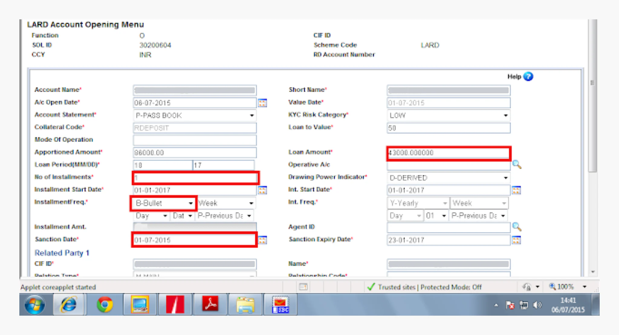
Before the redesign, opening a loan account meant working through a single form.
What the screen shows
Dense mandatory fields: almost every field carries a red asterisk, packed into two tight columns.
Limited visual hierarchy: identical labels and inputs in one panel, with nothing to signal which fields matter most.
A long form: a Related Party section starts at the bottom edge, and the form continues beyond the visible screen.
02Approach
Understand the system, then split the problem
Before designing screens, the team studied the existing system architecture and processes through stakeholder interviews, requirements elicitation, an analysis of the old loan system and whiteboarding workshops.
How a loan moves through the bank
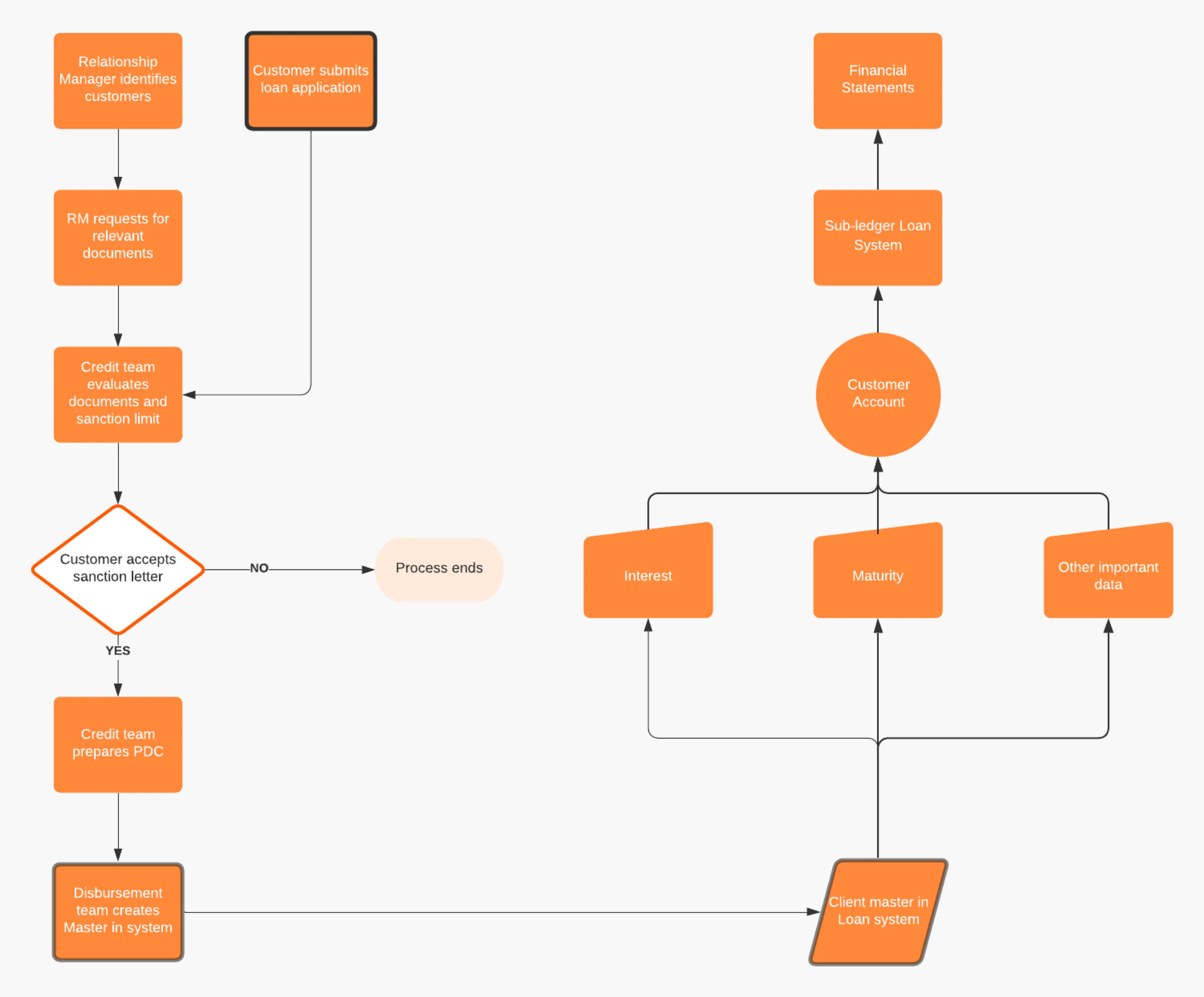
The team’s map of the loan process, from the first customer contact to the bank’s financial statements.
Reading the flow
A loan starts with a relationship manager identifying a customer, or with the customer submitting an application.
The credit team evaluates documents and the sanction limit; the process ends if the customer doesn’t accept the sanction letter.
Once the disbursement team creates the master record, interest, maturity and other data feed the customer account, sub-ledger and financial statements.
Two parts of the problem
The customer’s end: applying for a loan
Restructure and standardise the loan application, based on the partner bank. Customers enter only the most important information and backend integrations do the heavy lifting; whether they apply themselves or staff key in a paper form, the system identifies them by mobile number, customer ID or account number.
The operator’s end: managing loans
Take apart the separate task flows to understand the loan management system’s architecture, and design the UI from it. This is the part I worked on.
03Information architecture
Everything a loan needs, from its account
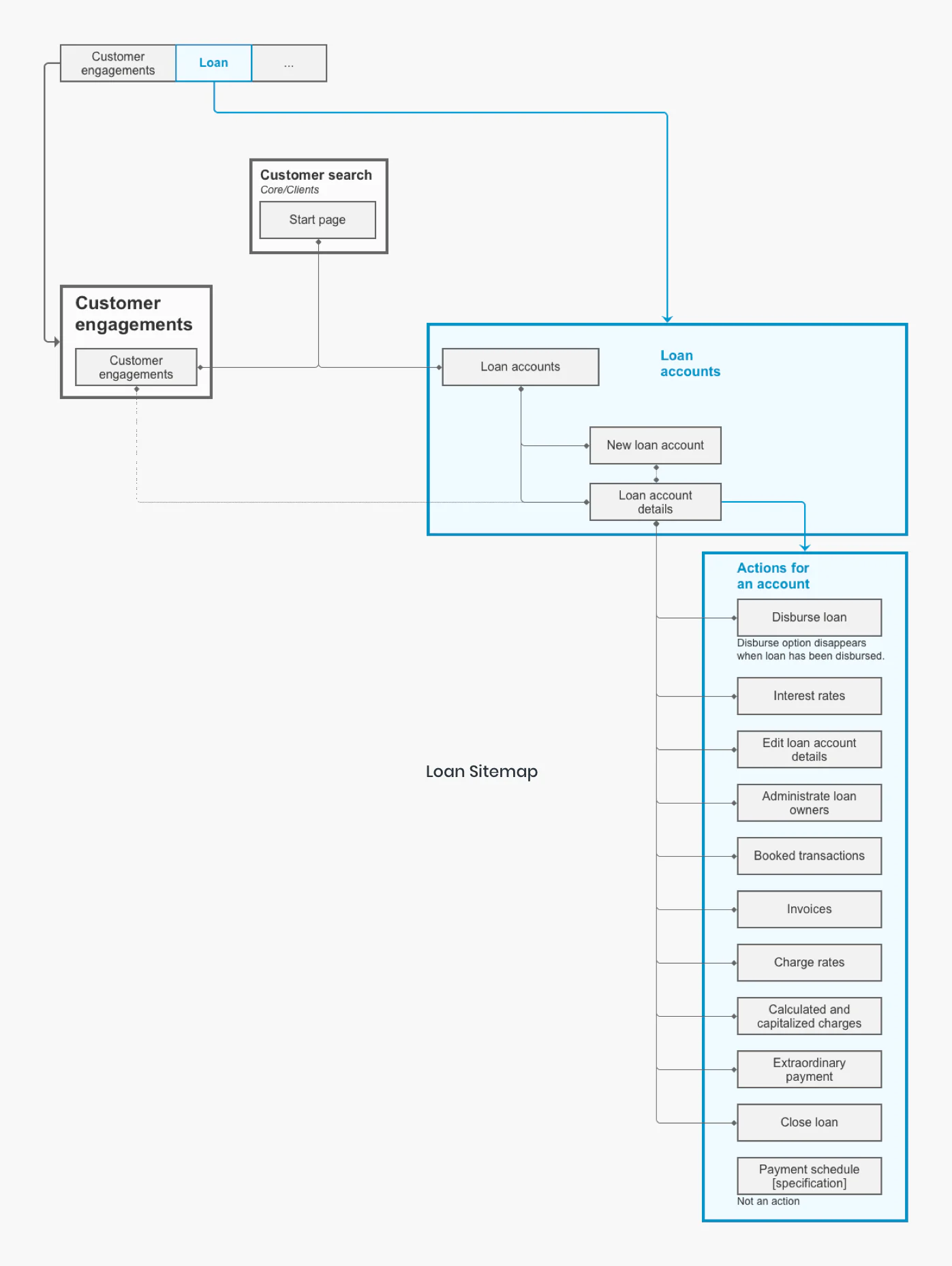
The high-level architecture organises loan management around a customer’s loan accounts, with every action on a loan reached from its account details.
Loan sitemap
- Two ways in
- Staff reach loan accounts from the Loan tab, or from a customer’s engagements found through customer search.
- Actions live on the account
- Ten actions branch from the loan account details — from disbursing a loan and changing interest rates to extraordinary payments and closing the loan.
- Only what applies
- Disburse disappears once a loan has been disbursed, and the payment schedule is treated as a specification rather than an action.
Create, read, edit
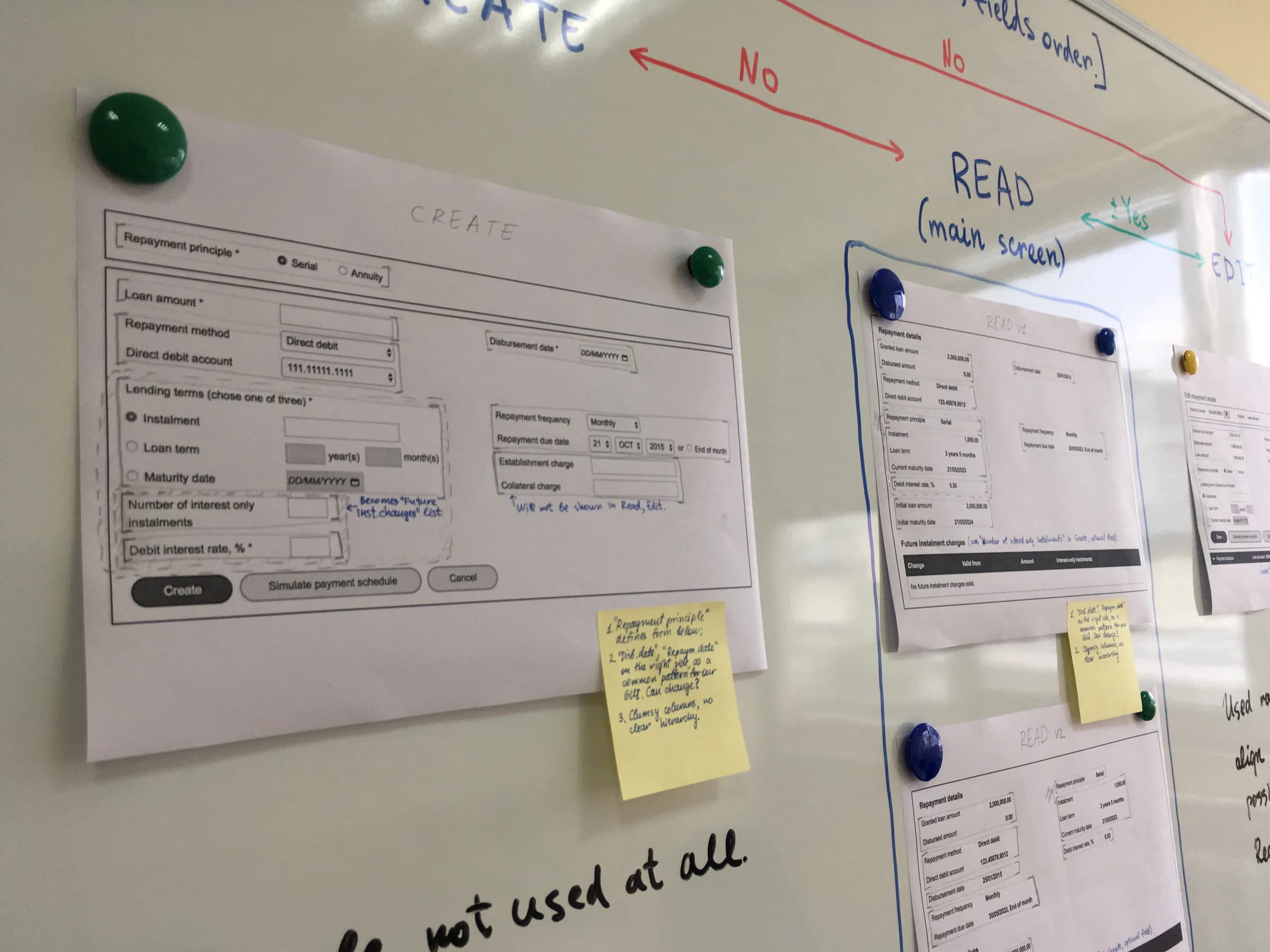
Printed wireframes for creating, reading and editing a loan account, pinned up and annotated in a whiteboarding workshop. The read view is marked as the main screen, and two versions of it are compared.
04Design decisions
Three decisions that shaped the screens
Each answered a constraint from the legacy system or from serving many banks with one product.
Decision 01
Order fields by how often they change
- The problem
- The legacy form gave dozens of fields the same visual weight.
- The proposal
- When Finacle is customised for a bank, categorise its data fields into a primary, secondary and tertiary structure on the back end.
- The response
- Each tier gets its own block: loan modification fields first, fund handling second, rarely modified backend information last — beside a summary of the loan and its agent.
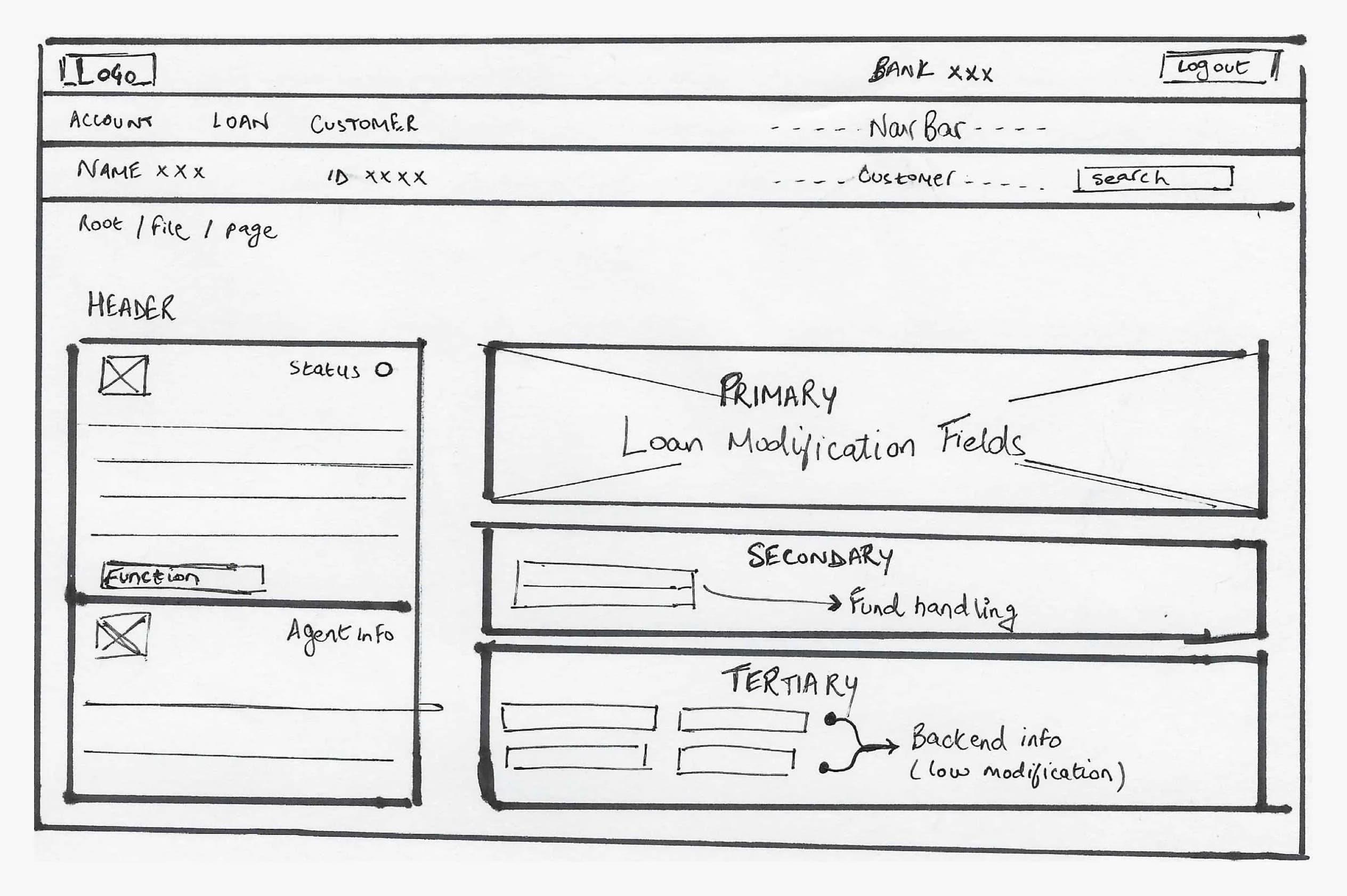
Where each tier landed
Loan modification: disbursement amount, value date, establishment fee and apportioned amount, with the Disburse action.
Fund handling: transfer details — amount, account number and comment — with Add transfer.
Rarely modified backend information: collateral code, sanction expiry, KYC category, CIF ID, drawing power indicator and operative account.
The takeaway
Instead of treating every field equally, the interface prioritised frequently used actions and moved rarely changed information into secondary and tertiary groups.
The aim, in the original case study’s words, was “making the UI more user friendly”.
Decision 02
Let the data decide how a field appears
Because Finacle is configured per bank, a field can offer several valid options or only one. The team defined how fields behave in each case.
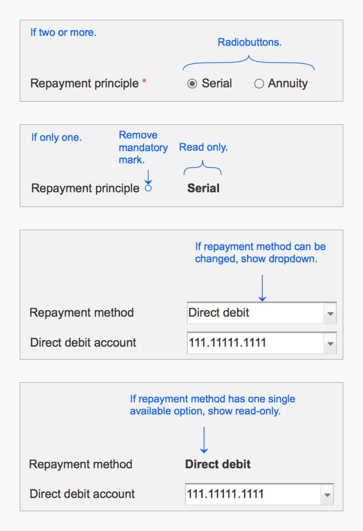
- Two or more options
- Radio buttons — for example, a serial or annuity repayment principle.
- Only one option
- A read-only value, with the mandatory mark removed.
- A changeable method
- A dropdown, when the repayment method can be changed.
- A single method
- A read-only value, when only one repayment method is available.
Staff are asked to choose only when there is a choice to make.
Decision 03
One calm interface, configured per bank
- The problem
- Staff work in the core banking system for most of their working day, and each bank asks for its own customisation.
- The proposal
- Keep the software standardised across banks, while making the UI client-customisable.
- The response
- A muted colour scheme with minimal loud contrasts, designed to be easy on the eye. The two original configurations below share one structure.
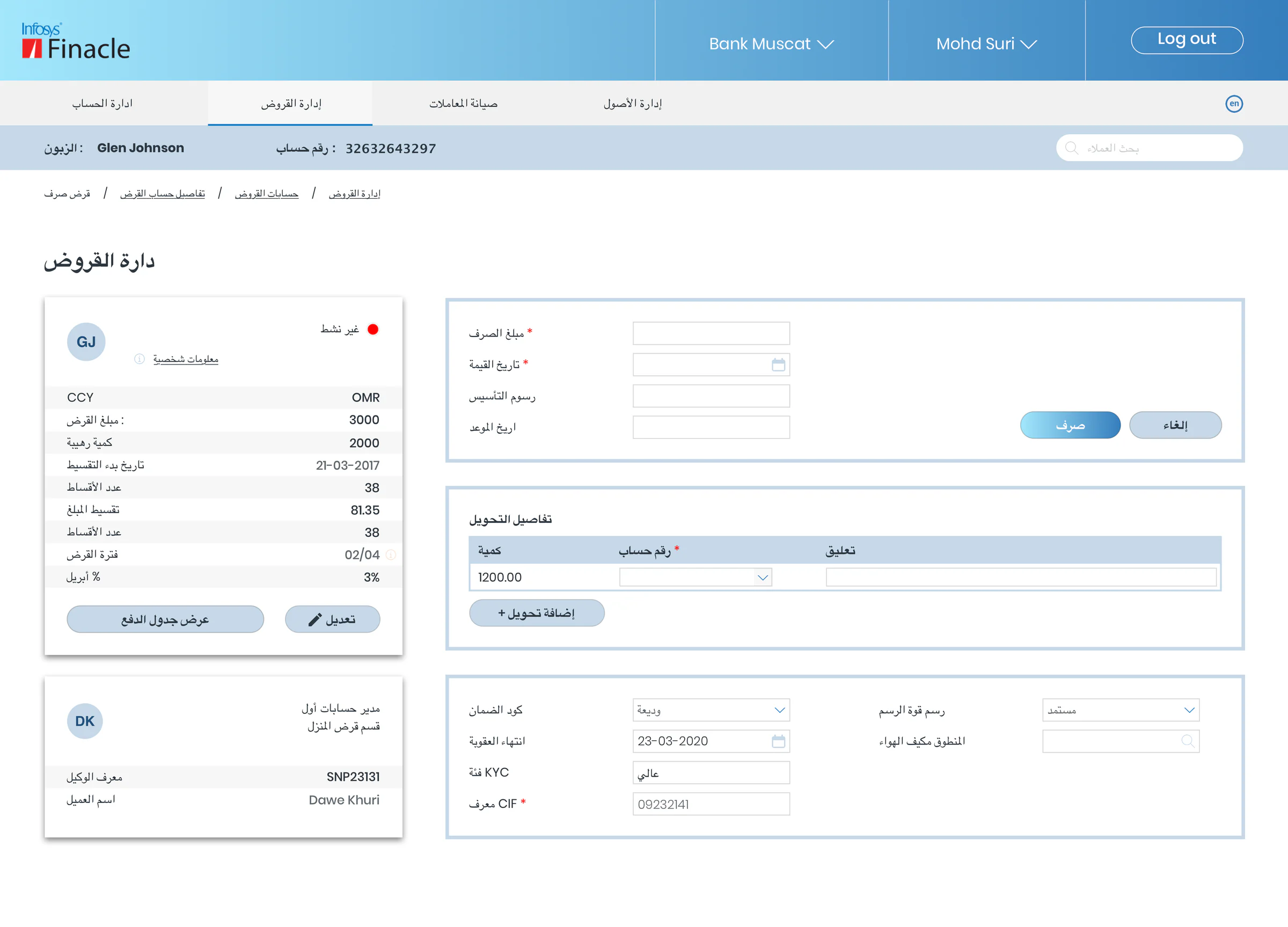
Stays the same
- Header, module tabs, customer bar and breadcrumbs
- Loan summary and agent cards on the left
- Disbursement, transfer and collateral blocks on the right, in the same order and position
Changes per configuration
- Colour theme: warm orange or blue
- Interface language: English or Arabic
- The bank named in the header and the currency in the loan summary
The Arabic configuration translates the interface but keeps the left-to-right layout, so it isn’t evidence of right-to-left support.
05Delivery
Handoff and first feedback
The web application was designed for desktop and large screens, with a responsive layout at two breakpoints: 1440 px and 1024 px.
Handoff
Handed over
To developers and testers, with design specifications, a prototype and continued support through Q&A sessions.
Testing
5 participants
The prototype was tested with three non-target users and two target users in a bank.
What testing showed
- Auto formatting was highly appreciated and induced a sense of satisfaction.
- First-time users took more time than expected to map out the important functionalities and fields. The team attributed this to the learning curve and hoped it would turn into efficiency for returning users — an expectation, not a measured result.
06In summary
Hierarchy as a usability tool
Put the fields that change first, let the data decide how they appear, and keep the screen calm enough for a full working day.